Case Study 1 of 5 | Back to Case Studies
Helping Restaurants Order and Checkout
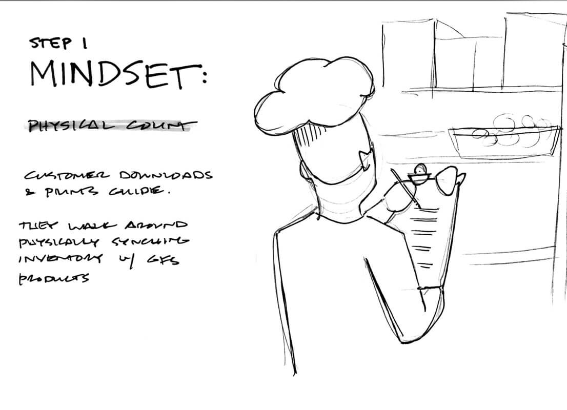
Creating a Simple Moment of Friction:
Adding data-triggered validation and error states decreased customer service calls by 24% in the first 6 months.
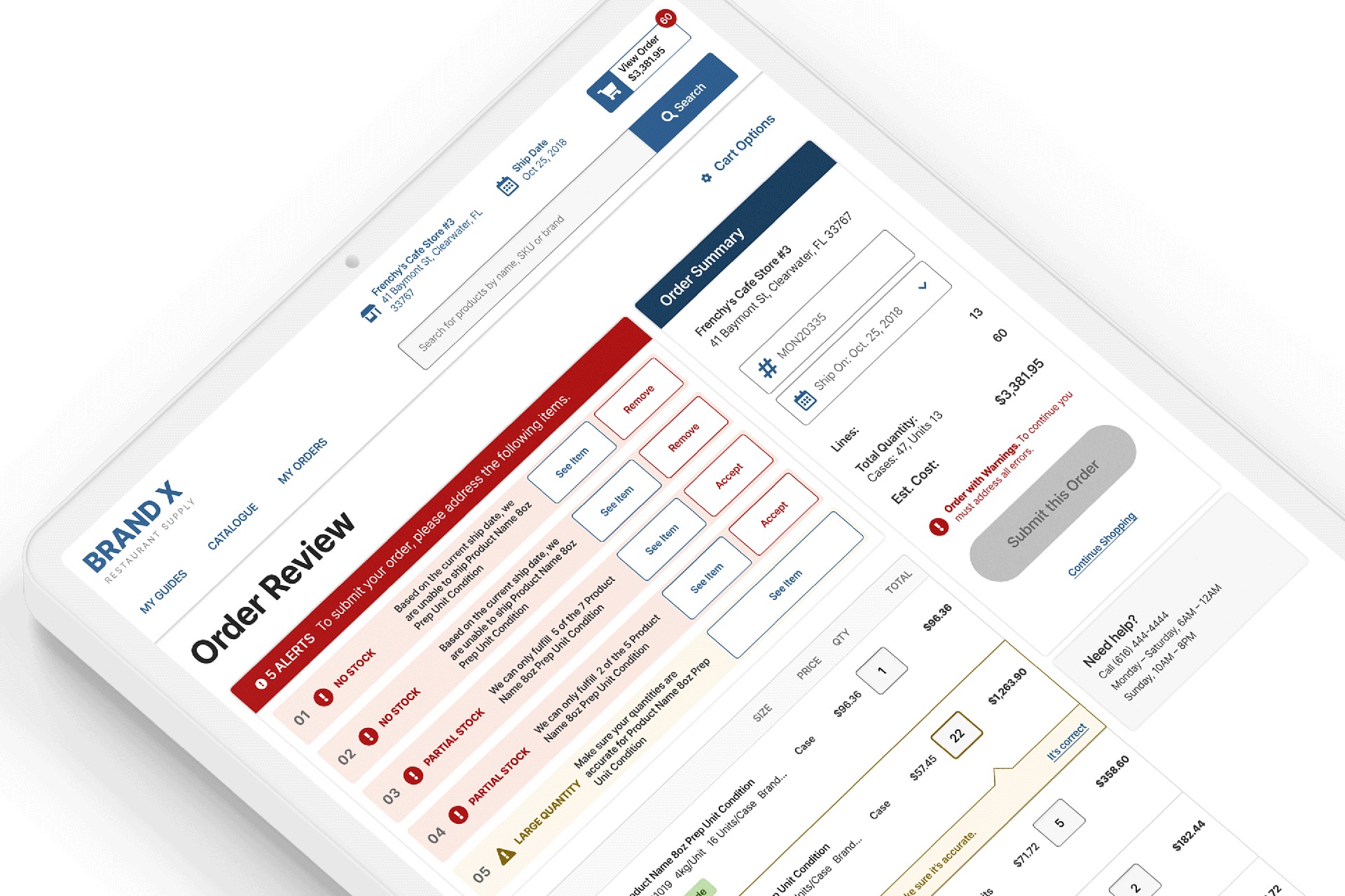
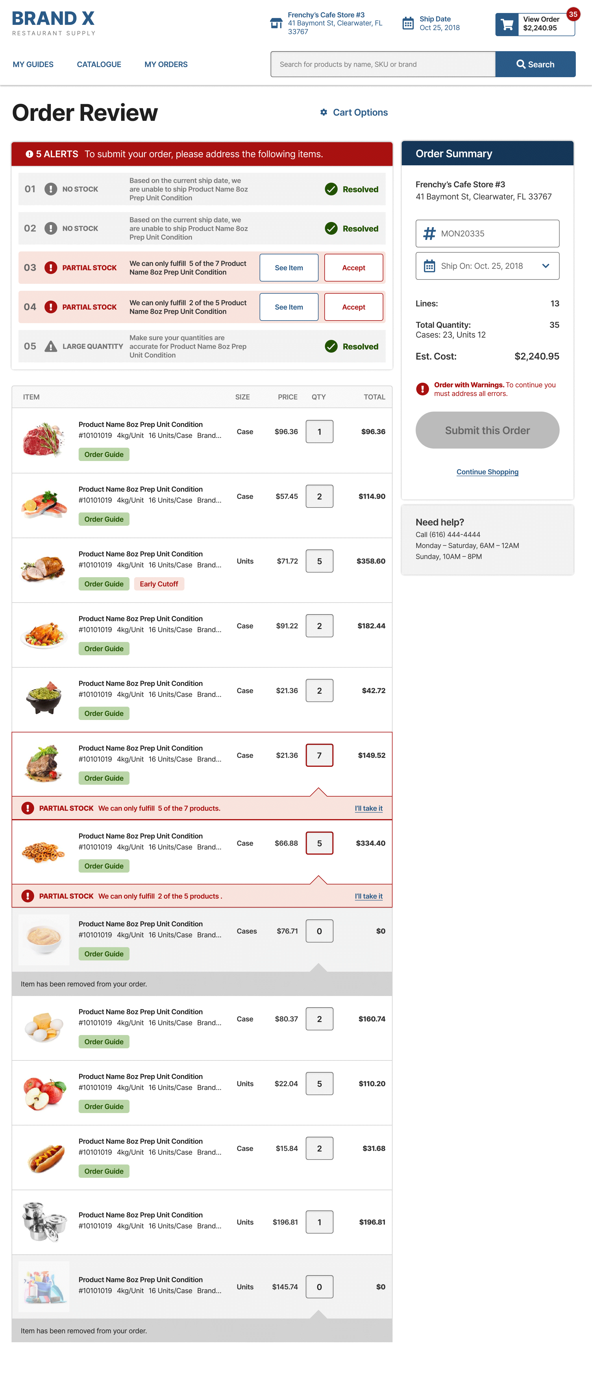
Context: The image displays a screen from an actual Online Food Ordering app (company name not disclosed). In the app, a chef or food and beverage director notices warnings on their order.
$~118k
saved in issued credits in 6 months.
3 Sprints
to complete design, testing, and development.
Find the efficient path. → Get others to come with you. → Move as a team.
Problem Statement
About twice a week a customer will place an order of, on average, 45 items.
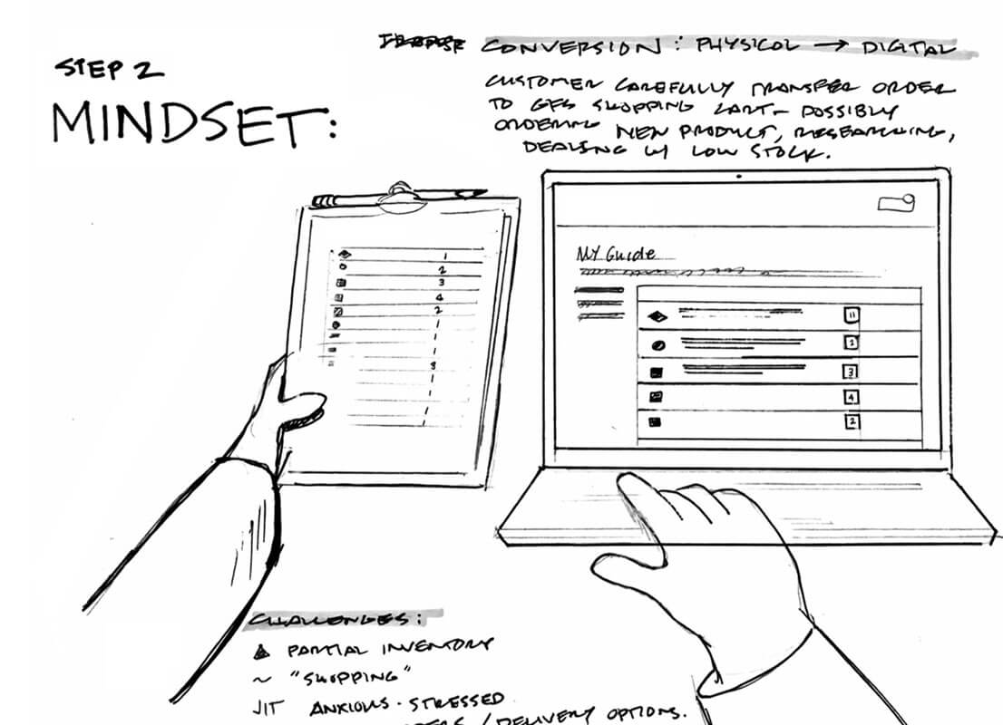
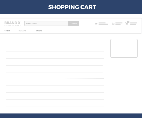
At the time, the shopping cart was a one-click checkout. Meaning, see items in shopping cart, click the Submit Order button. The previous iteration of the application presented cart exceptions in a series of indeterminate modals. As frustrating as that was, the novelty of one-click solution was widely loved.
But mistakes were happening. An order might possibly be racked with low stock items, entry errors, and additional order considerations. Someone once ordered 33 cases of mushrooms instead of 3. Large quantities of perishable food and special orders were non-returnable.
When this happens, food is wasted and credit memos are doled out to embarrassed or frustrated customers. Empathy for the kitchen managers meant understanding their stress, helping them see the errors, and building confidence and trust in the ordering application.
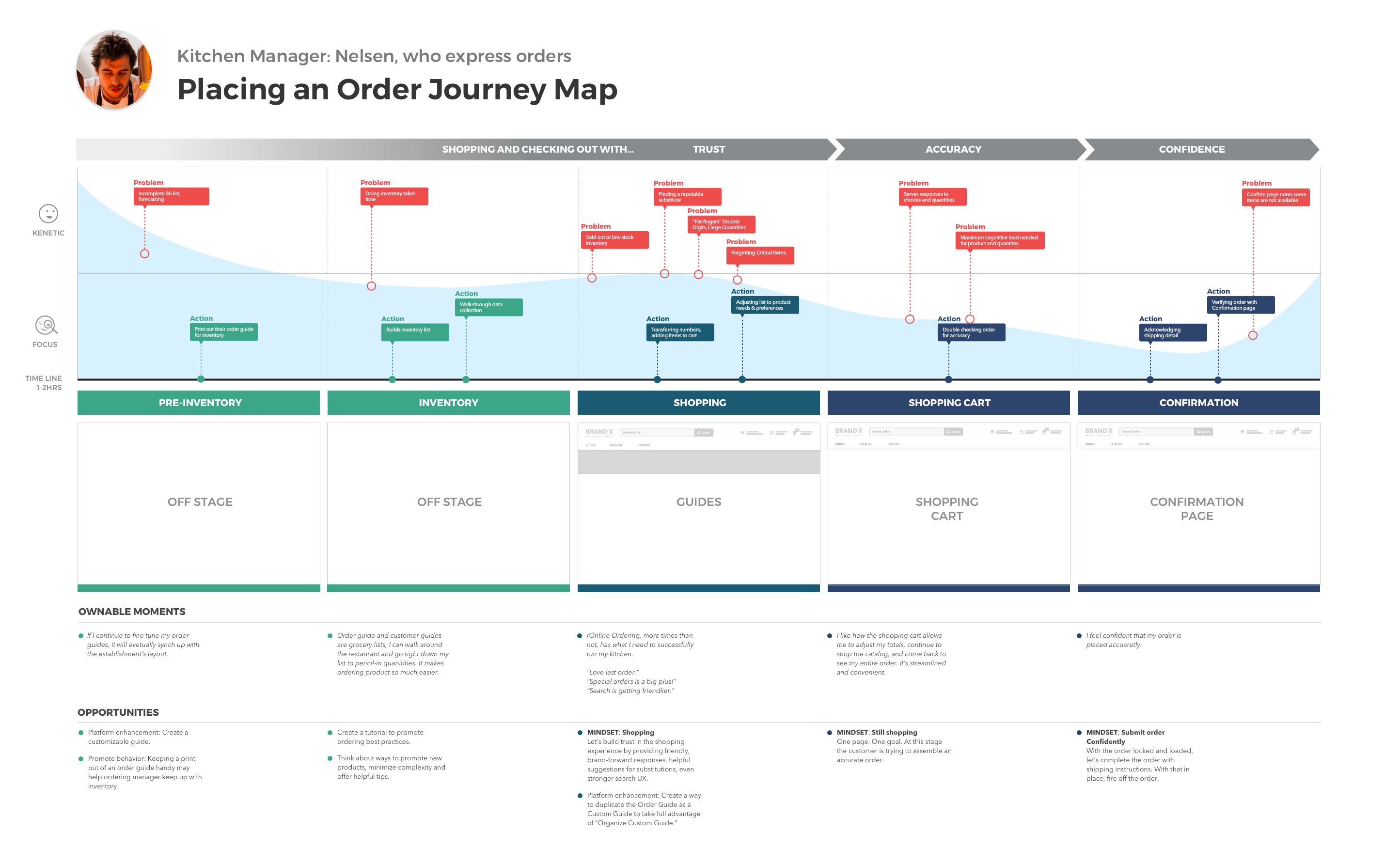
To understand the problem we needed to understand the life cycle of an order. We needed to tell a story with actual context.
Click the user flow to enlarge.
I have the time to sit down and focus on submitting the order, it’d be easier to resolve as I go. However, if I’m in a rush in the morning, I’ll submit my order and then come back to review the confirmation email a couple of hours later.
Kitchen Manager, Ontario-based restaurant
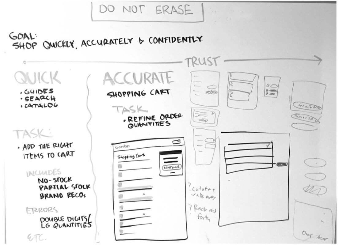
These are sketches from working sessions and presentations. Click each image for a larger view.
Scope & Constraints
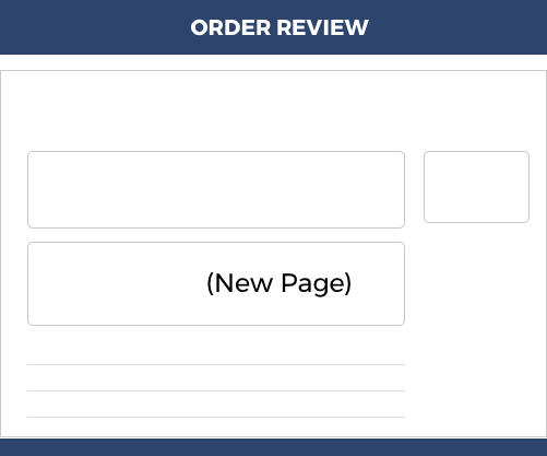
Order Review was not originally on our feature roadmap. I had to forecast its importance, build prototypes for persuasive discussions, validate the need and functionality with customers, and report the findings to the program as customer research.
Driven by the Agile methodology, me and the team worked in two-week sprints. Validation took about 3.5 weeks from prototype to results. In order to set expectations, goals were established and met during each sprint.
Comping the user flow for general, WCAG, and French interactions took another sprint. Backlog and development took 2.5 sprints. The entire project was handled by one feature team (approximately 12-15 people) in a 6 sprint cycle.
As a UX Designer, my job involved listening to anecdotal evidence, monitoring HotJar feeds for customer reactions, and participating in customer research sessions. I looked for trends and often advocated for validation and testing.
Requesting an additional page in the checkout flow required advocacy. It wasn’t initially clear to the team that this change would resolve a customer pain point; instead, it seemed like it might create unnecessary friction. Therefore, I led a white boarding session with stakeholders, project owners, and the software architect to visualize a win-win solution. The ideas from this session were transformed into wireframes, which were then circulated for reviews.
Working with the UX lead, I helped formulate a research plan. Their study required a prototype that closely resembled the actual ordering process, using real customers familiar with the application. They drafted a script to include adding quantities that would trigger warnings. With an active recruiting system in place, they were able to interview customers within two weeks.
They interviewed 12 participants (although 5 or 6 would have sufficed). A presentation was made to verify the results, and the green light was given to add the feature to the roadmap.
I then formalized the design in Sketch and InVision, and the comps with specs were uploaded to Zeplin. Throughout this process, he worked with the project analyst to confirm interaction states and ensure that the stories written for the backlog were accurate.
The backlog was managed by the project analyst. I attended those meetings to answer any questions from the developers.
As the project moved into the Sprint phase, I presented the work at daily standup meetings to monitor development progress. I was also on-hand for UI reviews to ensure that the code met UI, CSS, and WCAG specifications
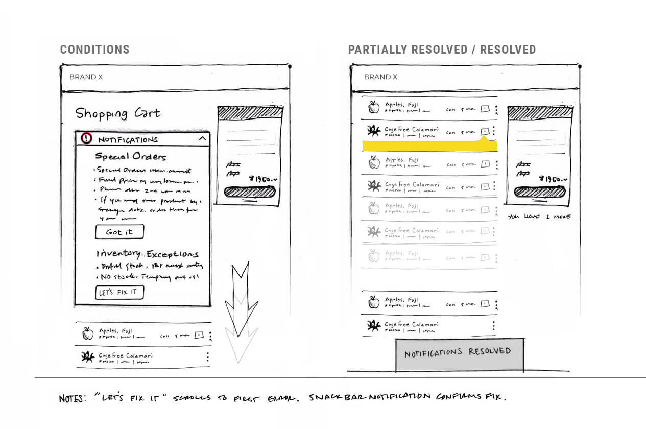
This early solution uses notifications and assistive scrolling to direct customer attention to items with inline errors. Click the image to enlarge.
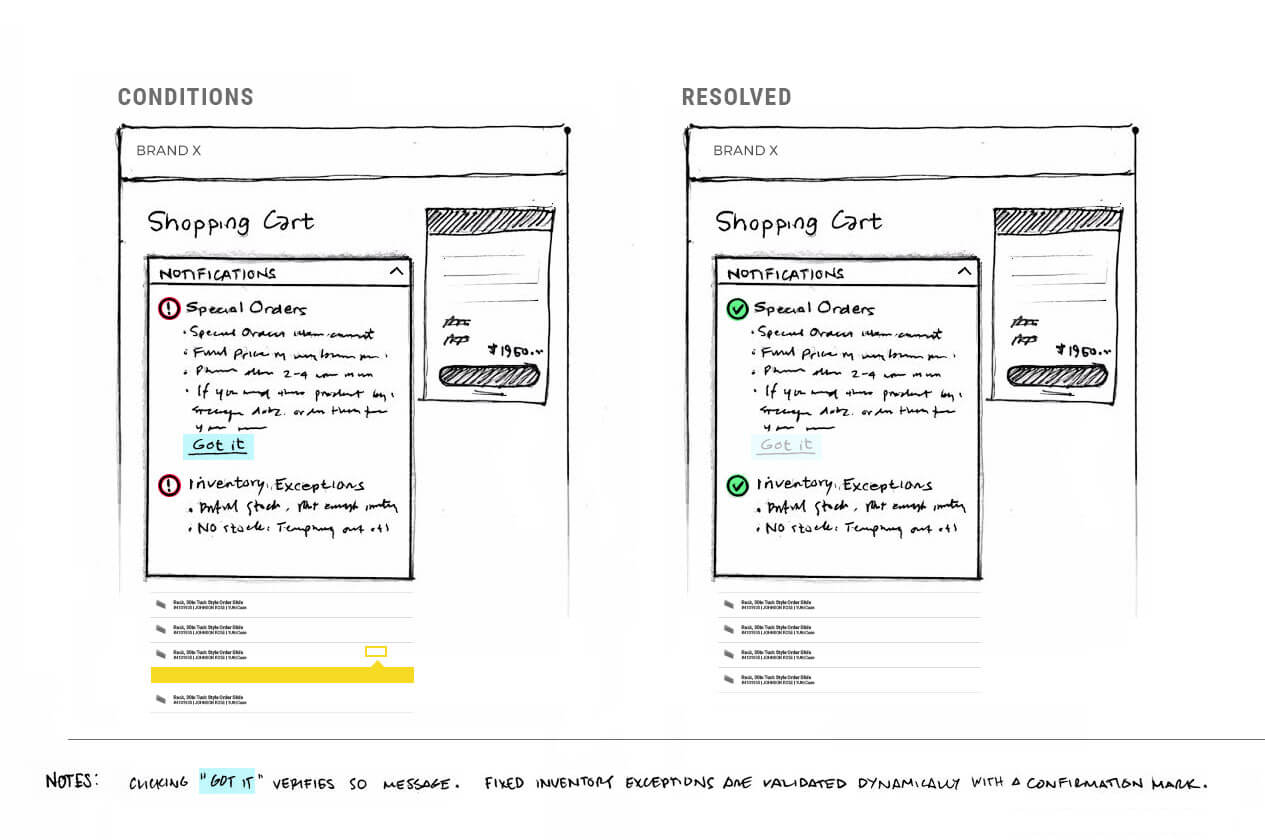
This one acknowledges the novelty of one-click order submission. It was recommended as a passive solution. Click the image to enlarge.
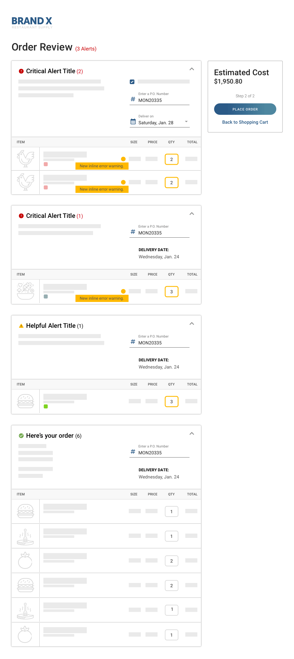
The early wireframe presents each warning type on a separate card. The final design, however, consolidates all warnings onto a single card to reduce scroll depth.
Research Questions
How effective are the Checkout notifications?
10 participants found completing the purchasing flow very easy.
How visible are the in-line soft warnings?
3 participants never noticed or mentioned the product card warnings.
Do users resolve issues as-they-appear or after completing their primary task?
If not busy, kitchen managers will remedy issues in middle of their ordering process. If rushed, they might not address them at all.
Where do customers do their ordering? How distracted are they?
Some kitchen managers have a private office and will sequester themselves to finish their orders. Most are out in the open and are subject to distractions.
Is there too much “cognitive load” with multiple Checkout warnings?
All participants found it easy to use.
Should certain warnings be removed from Checkout and placed in Cart?
Inconclusive, but 3 participants said if they’re building large orders, then it’s likely they will miss inline warnings.
When you are purchasing products online, which of the following is MOST important for you to know about?