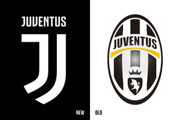
Juventus, one of Europe’s penultimate Champion’s League contenders dropped a new logo this year and it was a shape shifter. It’s not like any other soccer, er football, logo you’ll ever see. Most European teams wear a badge harkening back to the loyal order of the local athletic club. These heraldic badges are full of symbols, latin phrases, and all the fussy bits that don’t reproduce well at smaller sizes.

Look at what Juventus did. They rebranded with a brazen new look created by Interbrand. The logo manages to keep the shape of a badge while manipulating the negative space to great effect. What looks like a double J is actually a representation of the teams black and white striped jersey. This is a solid nod to the loyal fan. The mark reads like a fashion brand which is perfect since the team hails from Turin, Italy — arguably Europe’s most fashionable city.
Juventus FC isn’t some small league team. Founded in 1897, it’s the most successful team in Italian football. Some of the world’s best players have worn the jersey. To move away from so much history was a bold decision.
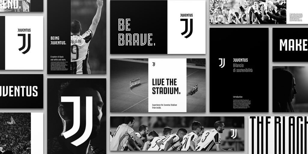
Interbrand’s goal was to elevate the team into a cultural phenomenon. They wanted to create a life-style experience around the team, build a premium ambitious appearance, and create an icon flexible enough display anywhere. I’ve yet to see the full experience but I like the promise it’s creating.
In my opinion the minimal look is fresh. As a soccer fan and a brand strategist, this was not what I expected. I don’t know what the fans think but the brand must love the freedom to express itself in a different context. It’s now a fashion brand, a brand of experience, and premium brand. It’s a bold step to reach a bigger audience.


