Two slightly different concepts both of which aid shoppers.
Say you are shopping your favorite eComm site for a pair of shoes. There’s a particular pattern to your shop. You see something you like, get as much information as you need. If you like it, you put it in your cart, and check out. We’re all accustomed to this flow. But occasionally, we go another route, browsing. During the browse you stumble upon an innovative tool that helps you find the shoes right for you. There’s an “a-ha” moment and venture through this user flow to find the perfect fit. This is the moment of discoverability.
Discoverability: Beyond the Expected
Discoverability is a cornerstone of interaction design, enhancing a user’s ability to stumble upon new content or features that might aid them in accomplishing their goals. A prime illustration is the Category Selector which appears under the header navigation on our brand homepages. At first, it might seem like a simple display of products, but a closer look reveals more. Hovering over the products displays two buttons: ‘Women’ and ‘Men’. This design choice anticipates the user’s needs, paving a smoother path toward the desired product.

September 2023
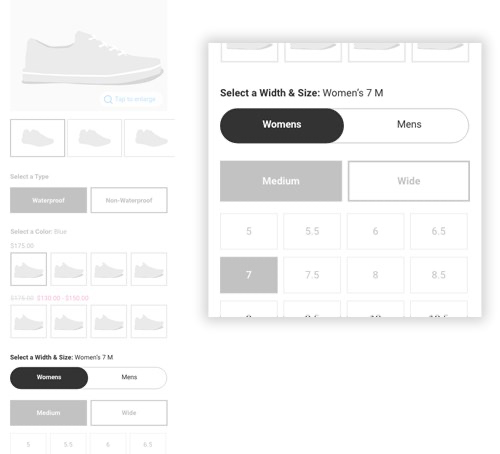
Similarly, consider the gender toggle on product detail pages (PDP). Some brands offer styles suitable for both men and women. Although the size chart denotes measurements, it doesn’t inherently convey gender. The solution? A toggle that specifies whether a size pertains to women or men. This toggle is designed to match the user’s shopping path. For instance, if a user clicks on an ad for women’s shoes, they land on a product page with women’s sizes preselected. If they wish to explore men’s options, they can easily switch.

September 2023
At its best, discoverability evokes surprise and delight, a sentiment we aim to embed in our designs.
Findability: The Intuitive Hunt
However, another term—findability—though related, stands distinct from discoverability.
Findability emphasizes the user’s ability to locate specific content or functionality they’re already aware of or assume to be there. For example, when shoppers wish to log into an e-commerce site to track an order, they instinctively look for an ‘account’ label accompanied by a person icon. They expect it, and more often than not, they find it. Such innate user behaviors highlight the essence of findability.

September 2023
Both concepts share a common foundation: aiding shoppers. Whether it’s helping them discover new features or assisting in locating known ones, design patterns play a pivotal role. For instance, the search bar is typically placed in the top right corner—a convention users have come to expect. Filters on the Product Listing Page are placed near the product list. Consistent navigation and familiar icons can simplify the process of finding or discovering. These are common user interface practices.
Conclusion
Have you ever encountered unexpected features on websites that left an impression? Share those experiences. We’re always eager to refine our platforms, blending both discoverability and findability to craft a delightful user journey.


