When Form and Function Unite
The Aesthetic-Usability Effect describes a phenomenon in which people perceive aesthetically pleasing designs as easier to use than less-pleasing designs.
This may sound like a no-brainer, but did you know that visually pleasing designs can mask usability problems? Or that less glorious-looking digital experience can actually function better than expected simply by following basic design patterns? In this article we’ll discuss the impact of usability and user perception.
People tend to perceive more aesthetically pleasing designs as intuitively usable. On the internet, here are some examples that come to mind: Apple.com, Madewell.com, RalphLauren.com, and Keenfootwear.com.
It could be that these sites have serious problems somewhere in the user flow, and one might ignore bad user interface (UI) issues simply because of the captivating product and how the website looks.
That said, aesthetics and usability are two distinct qualities for measuring an experience.
A Lesson Learned
Let’s celebrate a story worth telling. Back in early 2021, the UX team was looking to modernize the aesthetic of our big, clunky navigation header. We tested a global navigation header on Keds. It’s the header we have today — a Test Win, yes! The improvement organized the utilities in the upper right corner above search and cart and reducing the height. Our competitor sites were doing something similar. We were going in the right direction.

Old design, circa 2021
The late stages of the purchase funnel include Intent, Purchase, and Retention & Advocacy. Once a customer has added an item to their cart, they have moved into the Intent stage. Now the customer mindset is split between purchasing and last minute considerations: e.g: Shipping dates, promotions, late-stage product comparisons.
At this stage in the funnel, the shopper is focused on closing the transaction. Therefore, we chose to limit distractions, remove the header navigation, and added a stepper.
A stepper is a goal-gradient component used to guide customer through a multi-step workflow. It consists of a series of sequential steps, each representing a distinct stage on the path to completion. Once a stage is completed, it is usually marked with an icon or checkmark as a form of validation. We tested the stepper back in May, 2022 with a conversion increase generating an estimated $2.55M for the year.

New design, today
While we were at it, we had an opportunity to move the Chat button from the lower right corner of the browser into the Help section. Chat allowed shoppers to leave site feedback. It was always available and hovered over the UI in the lower right corner of the site. We made the move, launched it, and then the rumbles started to happen. Shortly after the enhancement, Chat volume decreased by 30% and email and phone calls increased slightly. We got the clean interface we wanted, but at a cost.
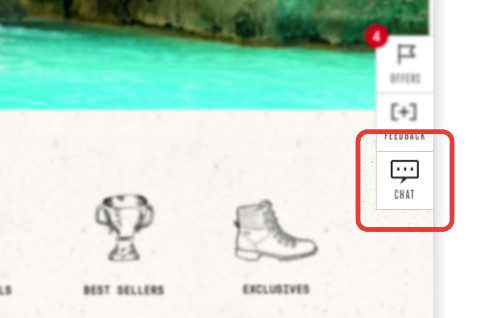
Chat, circa 2019
Lesson learned. Now, we research and define the information and optimization needed. We consult with our cross-functional partners to see what they need for the new functionality. Once we have the information and data, we find an appealing way to present the user experience and user interface elegantly.
Minimalism, Simplicity, and Cleanliness
These principles extend beyond aesthetics; they’re cultural constructs that shape our perception of beauty and value. While brands wield significant influence over the overall design, UX plays a pivotal role in shaping the interface underneath. It’s the intersection where technology meets user experience, and where testing and scaling test wins align with brand style guides. Brands define their ethos and have ideas to help shoppers understand the product. Together with development, we are in control of our destiny to have awesome sites that tell great stories and drive business.
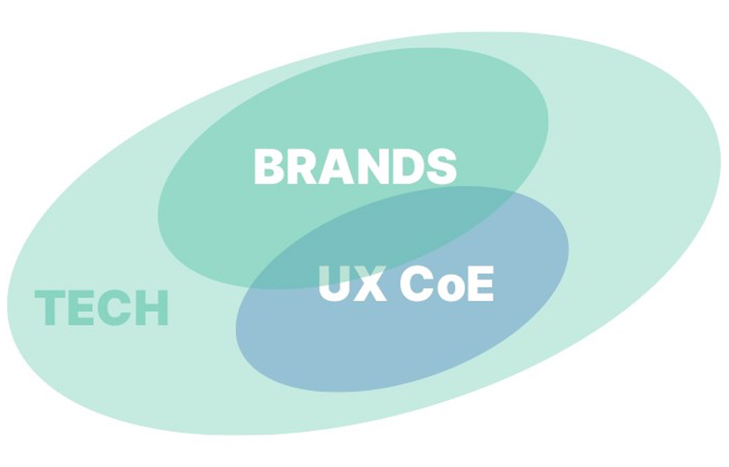
One of Digital & Technology Experience (D&TE) Groups goals for 2024 is to modernize our platform. One such framework to reach our goal is the aesthetic-usability scale. Let’s Go!
And if you’re wondering if your creative is resonating with shoppers, reach out to us. We can test your ideas.


