Save time and Effort by Building Once, Re-using, and Re-styling
Wolverine Worldwide is a company that promotes footwear and apparel through a wide range of products, visuals, and pixels. Each brand has its own unique visual identity and design elements, setting them apart. However, at the core of each brand’s website is a set of components that have been standardized to scale across all sites, following best practices and test wins. These components, called Core Components, are housed within a design system.
In this article, we will define a design system, explain why they are important, and explore how design systems reduce the time, effort, and costs of moving designs through development, ultimately boosting productivity.
A Design System Primer
A design system is a collection of reusable user interface (UI) components and guidelines that can help brands ensure consistency and efficiency in the design and development process. A cohesive design system can create a predictable experience for customers, establish trust, and improve brand recognition. It can also streamline the design and development process by providing a set of reusable components and guidelines that align with each brand’s identity.
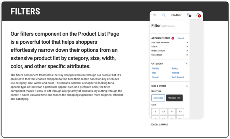
A design system encompasses various elements such as icons, typography, user interface components, and design patterns. For instance, a filter on the Product Listing Page (PLP) is a component composed of several smaller components. This filter is designed and constructed once, and its specifications regarding structure, appearance, spacing, fonts, and actions are documented within the design system. Serving as a core component, it can be reused and restyled according to the specific brand and product requirements. The design system encompasses well-documented components that form the foundation of the entire system, with each component following a similar documentation approach. Through this approach, we establish a repository of reliable and reusable components.

Sample page from the KX Design UI Kit
A Design System is Not a Style Guide
A style guide typically includes specifications on the brand’s logo usage, typography, color palette, imagery, and other visual elements. It is a comprehensive document that focuses on visual and aesthetic guidelines for a brand.
On the other hand, a design system encompasses a broader scope and goes beyond visual guidelines. It includes not only the visual elements but also the principles, patterns, components, and guidelines for designing and developing digital products.
Check out some of these beautiful design systems:
- Google’s Material Design System
- Adobe’s Spectrum
- Atlassian’s (Including Jira) whimsically named, Atlassian Design System
The Contributors
- In a federated model, where team members span the organization, contributors include designers, developers, product managers, UX researchers, and brand stakeholders.
- Designers establish the visual language, design principles, and components for consistency and usability.
- Developers provide technical expertise for system implementation and integration.
- UX researchers conduct research and testing for component optimization and user experience.
- Product managers offer strategic guidance to align the system with development goals and user needs.
- Brand stakeholders contribute their expertise to meet specific organizational and audience needs.
- Fostering a collaborative culture where contributors actively participate and share their expertise leads to a comprehensive and effective design system benefiting our brands, our organization and our shoppers.
The Benefits
Having a design system brings several benefits when it comes to building digital products and campaigns.
Firstly, a design system ensures consistency. By establishing standardized design elements, such as color schemes, typography, and templates, a design system helps maintain a cohesive brand identity across different touchpoints. This consistency strengthens brand recognition and enhances the user experience by providing a familiar and seamless visual language. With a Design System, designers can quickly deliver a unified suite of page layouts and emails.
Secondly, a design system promotes efficiency and scalability. With predefined components, templates, and design patterns, designers and developers can streamline their workflows and save time and mental energy when creating new web pages, social media assets, or email templates. This ultimately saves time and brainpower.
Furthermore, a design system promotes innovation and experimentation. With readily available components, teams can try out new ideas, iterate on existing components, and conduct A/B testing scenarios to optimize website performance. A design system supports continuous improvement and growth.
To sum it up, a design system enables brands to deliver a unified visual experience, streamline workflows, foster teamwork, and drive ongoing improvement across various digital channels. Once built, it saves time and effort.
Let’s build this together
How can you get involved? Over the next several weeks, the UX Design Team and I will be conducting interviews with our commercial designers, developers, and key stakeholders to review the work in progress. From there, we’ll create a contribution model and build a cross-functional partnership to adopt a broad and ever-growing design system to service our collective needs.
Again, this will only work if the product, the Design System, is championed by the organization. It has to work and bring value to you, the dev teams, the design teams, and our contributors.
Reach out to Joe Morris, Sr. UX Designer, to get involved.


